Tuesday, 12 March 2013

Windows 8: Bringing the Desktop Back

In my last post I talked about how I felt Windows 8 had pushed ahead too far into the tablet OS space and left the desktop era trailing behind. In essence there are millions of PCs/devices which are currently capable of running Windows 8 yet are not designed for the brave-new-world interface that is the Modern UI. I did say at the end of that post however that I would suggest ways of improving the situation and this is what this post will be all about.

Disclaimer: I am but a humble software developer expressing my own opinions here. I do not work for Microsoft and definitely have no sway in how Microsoft builds its products. I am also not an expert in operating system design and architecture and cannot vouch for whether anything I say below is technically feasible – consider everything below a “wishlist” of what Windows 8 could be.

This post also contains diagrams and mockups created with my own two hands so they might hurt your eyes – I would strongly suggest some protective eyewear before you continue reading.

Splitting Things Up

Microsoft took a gamble with Windows 8; they wanted it to be the operating system that could be installed on any device/system, small and large. Whereas in the past they tried to shoehorn the behemoth that is Windows onto a smaller form factor – see Windows Mobile for an example – this time they are working the other way around, refining their Modern UI concepts on small devices first and then scaling up to larger systems.

The problem I see with this though is that a full-fledged PC and a tablet are not the same; the “windows” concept works well on a PC and the fullscreen, one-app-at-a-time concept works well on a tablet. But Windows 8 tries to do both at once and then the inconsistencies appear; some apps appear in multiple windows on the desktop while some must take up the entire screen and hide everything else behind it.

Ultimately these two ideologies don’t play well together. Apple, on the other hand, have two operating systems - OS X, their full computer operating system and iOS which is their phone/tablet operating system. Both cater to their target devices by only doing what is appropriate on each device with some room for crossover. It is this idea that I think should have been done for Windows but in this case possibly have one OS for each target device – phone, tablet and PC – all running a core Windows system.

Because Microsoft loves to make beautiful architecture diagrams how about I have a stab at one to demonstrate what I mean:

Architecture

Please bear in mind that this is not very complete and probably laughable but basically I see things working as:

  1. Defining the Windows Core operating system which would contain everything that every other Windows-branded OS requires at a minimum e.g. the kernel with process multi-tasking, input (including touch), output, networking, graphics and even the new Modern UI stack.
  2. Then have the Windows Phone OS be based off of the Core. This would be the smallest OS provided due to the hardware constraints of a phone device but would build upon the core OS to include phone services e.g. SMS.
  3. Then have the Windows Tablet OS be based off of the Core and build upon it to provide enough for a tablet device. Effectively this would be what the Windows 8 Modern UI would become.
  4. Finally have the Windows Desktop OS be based off of the Core and complete the picture; this would provide the full package of components including legacy Windows support (which phones and tablets do not need).

Note there is already the concept of a “core” operating system – Microsoft developed MinWin to disentangle all the dependencies Windows has on its sub-systems and produce a minimal version of the OS to base everything else on – but this idea would take it further. As a lot of the future of Windows is being tied together it makes sense to me to include all the common components into one core system and then build upon them where it makes sense. This means that the Phone OS can focus on just being a smartphone whilst the full Desktop OS can focus on being the productivity powerhouse it used to be.

I also see nothing wrong with including modern concepts into the core OS such as the Modern UI stack or touch inputs – although desktop PCs today may not make much use of them in the future they certainly could.

So that is how I would split them up, but what would each one look like?

Windows Phone

Image courtesy of CNET UK

This one is simple to define as it already exists. When I first got a Windows Phone 7 device I was actually quite impressed that Microsoft almost nailed the entire thing on the first try – thereby breaking their usual “3rd release is best” cycle. And as someone who has used it for a couple of years now I think it works pretty well when considered it is used for things like phone calls, staying connected to your friends and doing things on-the-go. So my thinking is just leave this one be and that is the Phone OS sorted. Next?

Windows Tablet

Image courtesy of Microsoft

This one is also quite simple as well because this would be what Microsoft has been trying to push onto us since Windows 8 was first shown to the world. Basically the Tablet OS would be the new Start Screen and Modern UI apps - no desktop or legacy at all. However, there are a couple of things I would change to make it the tablet OS it should be.

First of all I think the Charms bar should just be ditched as I don’t see any point to it. I think it is meant to show that every app has the capability of several core concepts – Search, Share, Devices (which I’ve never used so don’t even know what this is for) and Settings. But the problem I see with it is that not every app ever developed has to include these charms as sometimes it just does not make sense. Let’s take the example of a simple calculator app. So how many charms would we need for this to function?

  • Search is useless since there isn’t a lot of content to search for
  • I don’t particularly feel the need to Share my calculations on Facebook
  • I don’t really need to print anything usually so Devices isn’t required
  • Calculators are not that complicated so I can’t see too many Settings being needed either

Which means that this app would not require the Charms bar at all – selecting each charm in turn would result in me being told that this function is not available, something I would have to actually click through to find out.

Instead, why can’t we just resort back to some tried-and-true user experience conventions that have been built up over the past couple of decades? For instance, everyone now knows that a rectangular box with a magnifying glass next to it is a “search box” where you can search for things, so why can’t Modern apps simply use the convention too – it’s not like there is a lack of screen estate in some cases.

Store

The Windows Store app now with a search bar to clearly show that you can search for apps

Likewise every website under the sun now has all sorts of “share” buttons littered over their pages, so we could also have Modern UI apps just add a “Share” button when it is appropriate to do so.

Windows Desktop

Now we get the the crux of this post, sorting out the Desktop. I highlighted a few issues I had with the Windows 8 desktop as it is now and the main issue was that every Modern app must be made fullscreen. Now my idea around this problem is simple: put Modern apps in windows again and let the user organise/resize them to how they want them to be. But it turns out someone else has already thought of this; Stardock are developing software which does just this called ModernMix.

An example of how I think desktop should handle Modern apps and what ModernMix is already capable of. Image courtesy of Stardock

To me this feels like the best fit for the desktop – Microsoft could still deploy the new Modern UI apps which use the newer Windows RT technology but not at the expense of what came before it. Remember, Windows is all about building on what already exists. Users would get better, modern applications without sacrificing their own productivity or choices.

And while we’re still removing things let’s get rid of those pesky “hot-corners”. At the moment if you want to see the Start Screen, switch applications or view the Charms bar then with a mouse you can move the pointer into one of the screen “hot” corners and the appropriate action will pop-up. Except that these hot-corners are annoying – it feels so slow and cumbersome to move the mouse all the way to the end of a screen, wait for something to appear and then click on it, which is why I avoid them like the plague and use keyboard shortcuts instead. Simply put the Start button back – which can trigger the Start Screen if Microsoft insist – and that’s all that is needed really.

So now we’ve removed the dud features of the desktop, how can we progress it forward? For a start if Microsoft are committed to this new Modern UI/UX then they should start updating their apps and control settings to use it. This can allow them to start thinking about how to integrate touch controls to important Windows features ready for the future.

One part of Windows 8 I do really like is the live tiles that animate and show all sorts of live information for each application. How could that be applied to the desktop? Perhaps live tiles could be arranged on the desktop itself like regular desktop icons at the moment – a bit like widgets but at least tiles can be organised better.

DesktopTiles

A mockup of how Live Tiles could be placed onto the desktop

We Can but Dream…

These are some of my wild musings as to what Windows 8 could have been, though I imagine these will never come to fruition; once something is baked into Windows it stays there and Microsoft seem quite committed now to forging ahead with what they’ve got. I am hoping though that Windows “Blue” will try and address some of the usability issues with the desktop/Modern experience but we shall see.

Wednesday, 27 February 2013

Windows 8: A Tablet OS Stuck in the Desktop Era

Start

It’s been a few months since I upgraded my laptop to Windows 8. At the time Microsoft were letting you purchase the upgrade for around £25 which sounded like a bargain to me – my wife got it even cheaper at £15 due to purchasing a Windows 7 laptop recently. So I dutifully downloaded it, was amazed at how the installer just seemed to work (surely upgrading an OS should be more troublesome than this?) and set about using it for everyday use.

So after a few months of use what is my overall opinion? While I find it perfectly usable I think Microsoft may have been a bit too ambitious trying to convert Windows from a big desktop OS to what is now primarily a tablet OS and the jump between the two is currently too large. Now I’m not saying it is a complete disaster – we’re not at Vista levels at all – as there are still quite a few things that I am happy with but given that my laptop has no touch inputs at all and the entire OS seems hell-bent on pushing these new Modern touch-enabled apps in your face then it leaves a user like me feeling a little left behind in this brave new world.

But first let’s focus on the good parts of Windows 8 before I venture into the “could be better” points.

Performance

Windows 8 is fast, very fast sometimes. Whatever Microsoft did to the internals of Windows to make it fast enough on less powerful hardware has also paid dividends on more powerful hardware. A cold boot is faster than Windows 7, waking it up from a sleep state even better (it feels like around 10 – 15 seconds to me) – when I compare it to starting up my Windows 7 PC at work it feels like it takes an age to just get to the login screen now.

Live Tiles and the Start Screen

I own a Windows Phone 7 device so I’ve already grown accustomed to the UI intended for all future Microsoft products. I personally think that the Live Tiles idea is probably one of the simplest, best and, dare I say it, most original ideas that Microsoft has come up with in a long while. Live Tiles act as both a shortcut to start an application but also as a widget which provides live information to you when you just stare at the Start Screen; information changes on it as you watch it to show you your latest emails, latest Facebook/Twitter mentions, photos etc. If you have a good enough set of apps installed your Start Screen can suddenly come alive with all kinds of information and I quite like waking up my laptop in the morning and quickly seeing how many emails I have.

And speaking of the Start Screen I have no problem with it; many people got indignant over the loss of the Start Menu but frankly I haven’t missed it at all. It also comes with some nice bonuses such as being able to uninstall anything straight from the Start Screen, and the search functionality is far better than Windows 7.

Desktop Improvements

Despite the focus clearly being on the Modern UI the existing desktop has seen a few new features too.

TaskManager

The Task Manager is now something I love rather than something I use to kill non-responsive processes. The detailed view can show you the CPU, disk, memory and network usage of every process running which provides you far more information than before. Checking network usage is actually incredibly useful – I had problems recently with the BBC iPlayer and used the Task Manager to confirm whether it was actually downloading anything or not.

Explorer

The Windows Explorer has also seen some improvements such as a ribbon bar to replace the menus (though collapsed by default, I’m guessing due to all the complaints from various users during the consumer reviews) and much better handling of copy-paste operations such as detailed progress and resolving name conflicts.

OneNote MX

OneNoteMX

Not a part of Windows 8 per se but I thought I would give this a mention; I love OneNote in Office and the OneNote MX app you can get from the Windows Store is probably one of the best examples of a Modern app I’ve seen yet. It’s not perfect – sometimes feeling a little like a prototype of what Office might become – but the fact that I can write my notes and have them sync to SkyDrive to later check on my phone/work PC makes it a fine example of how Microsoft is starting to think beyond the “single PC” ideology that has been governing Windows for decades, plus it is a great example of what you can achieve in a Modern app.

But…

So there are a few things I am happy with and I wouldn’t want to go back to Windows 7. But having said that there are still quite a few problems with it and they tend to revolve around the sudden shift in focus on making it into an operating system designed for every device imaginable.

Modern Apps

I’m going to make a sweeping generalisation here: nearly all Modern apps suck! OK, maybe that is a bit too harsh so let’s try to break it down as there are several areas to this.

I have no problem with the “Metro”/Modern UI style as I generally quite like the simplicity of it all; on a phone it works quite well, and I imagine a tablet would be the same. But for a widescreen monitor things can tend to look a little sparse with a lot of empty space, particularly since Windows 8 forces all Modern apps to be full-screen. Also it is a style which allows less artistic people (e.g. developers like me) to be able to make something that generally looks quite good and hopefully more consistent with the rest of Windows but this is a double-edged sword; a lot of Modern apps I’ve seen so far are devoted to lists/grids of rectangles with some text in it so they are never that pretty to look at.

SkyDrive

This is what my SkyDrive app looks like – pretty sparse and flat wouldn’t you say?

These apps are also the latest in a long line of developer technologies that Microsoft tends to flaunt every few years; this time Windows RT is the latest hotness. As all these Modern apps are basically version 1.0 then it becomes very clear that this is a platform that needs time to grow and develop. Currently many apps I’ve seen can be very basic or at worst buggy. MetroTwit for instance never seems to be able to load my Twitter timeline, something I would have thought quite crucial given what it is designed for; as a result I uninstalled that almost immediately.

The fact that all Modern apps have to run fullscreen may make sense on a tablet where screen estate is limited but I really cannot see the point on a full-blown PC. At my workplace I have two monitors so I would be limited to viewing two apps at once whereas previous Windows versions would allow you to have as many windows open as you wanted and organised however you wanted. I mean, do I really need to devote an entire monitor just to see my Twitter feed? At the moment the Modern apps I do use I have to constantly switch between with Alt-Tab to get anything done.

Touch input is the main draw for Modern apps – but only if your hardware supports it. Using a mouse and keyboard is possible but not the best, in the same way that touch is not ideal for using the Desktop. Given that most new PCs would be supplied with Windows 8 by default now but not necessarily the hardware to use it for it's ultimate potential this becomes even more frustrating.

But probably the biggest problem with Modern apps so far is not related to technology or usability but one simple question: what are they for? Every single Modern app I’ve seen has a very clear focus, which is to act as a frivolous, content-spewing machine; why not check Facebook or Twitter or news or weather or anything that is actually not very important to your life or work. Can you honestly see a line-of-business Modern app existing as things currently stand? I can’t. Given that Microsoft have spent so long trying to keep their enterprise customers happy it seems they have now switched sides rather abruptly and are now too focused on the casual user instead, rather than find a happy medium.

Windows Store

Fine, lets assume that you do find some good Modern apps – that means you need to find and install them somehow, which is where the Windows Store comes in. Except that this is also a terrible Modern app in itself.

Store

Take a look at the screenshot above; what attracts you to getting, or even buying, any apps? Do any of them jump out at you? Of course not, they are all flat squares with possibly a single image and their name, basically an example of where the “Metro”/Modern style fails.

I’m no expert in commercial dynamics but if I went into a store to buy something I would expect to be bombarded with colours, images and banners trying to advertise everything under the sun – what we have here instead is everything hidden away and not showed off to its full potential. There may well be some truly excellent apps hidden away in there but Microsoft are simply not marketing them well enough. Since these are all you can install on a tablet device I would have expected something with a bit more flair to try and entice people to parting with their money.

StoreSearch

Searching through the Store is not a very informative experience either

There are also technological problems too; the Store app is incredibly buggy. I’ve encountered warnings saying that internet connection is lost constantly and apps failing to install for some bizarre reason. If this is the only way into getting any software onto your device the Store should be as rock-solid as possible. It also poses this question: if the Store app manages all your Modern app updates how does the Store itself get updated?

General OS Gripes

Finally there are some general niggles that bother me.

Charms

The Charms bar I cannot see any point in, even on a tablet. When you swipe in from the right-hand side you are now presented with a bar of “charms”, or extremely common operations that are now built into the OS, such as Search, Share and Settings. Search and Settings I get – nearly everything these days require these functions – but Share simply looks like a symptom of the times we live in; perhaps there will be clever uses of this charm but for now all I can see it being useful for is to share things to Facebook/Twitter. If I’m working in Microsoft Office do I really need to tweet to everyone that I’m working on a PowerPoint presentation? I can see some point to sharing though but why not just limit it to the applications that require it rather than provide a great big button directly in Windows itself?

Windows 8 is also clearly a transitionary OS as is evident by having both the “Modern” Windows and the “legacy” Windows but this divide can also be confusing as there are now inconsistencies between how to do things. For example:

  • Windows 8 has a fullscreen settings screen but this is not enough to control everything so sometimes you will have to dive back into the Control Panel (which has not been “modernised”). And interestingly some settings are duplicated for no particular reason – setting up a Homegroup can be done exactly the same in the Control Panel or the new setting screen, so why have both?
  • The Desktop can also view the charms bar yet these become even more useless since the Desktop was not built to use any of them. If that is the case why show it at all?
  • The Desktop shows the time, date and items like network connectivity and battery power in the taskbar. The Modern UI hides all of those useful indicators until you make the charms bar visible.

Inconsistency

An example of UI inconsistency – I’m in the old Desktop yet now I’m also in the Modern UI too?

Ironically in this touch-enabled future keyboard shortcuts have become the only way I can actually get to anything quickly these days; shortcuts like Win+C are far easier to perform that hovering my mouse cursor into a “hot-corner”, dragging down slightly and clicking on the charm I need. Also, as an experiment, get a brand new user who’s never seen a Windows 8 machine before to try and figure out how to close a Modern app or even how to switch off the device – see how long it takes them before they give up. I had to look these up online before I could figure it out and even now closing a Modern app is not intuitive – Alt-F4 to the rescue!

Is it Really That Bad?

No, of course not. Like I’ve already said I do like Windows 8 but mainly from a desktop user perspective. And while I do have a few Modern apps that I like overall I’m just not impressed with them.

The problem I see is that Microsoft took a big gamble trying to get Windows to work in such a way that it is suitable for any device, be it a phone all the way up to a PC, but I’m not so sure this gamble is paying off. Each device type is meant to cater to a particular set of requirements; phones and tablets are not meant to be processing powerhouses and are meant to be used on-the-go so making lots of content-consuming apps makes sense for those devices. PCs and laptops are meant to be more powerful and allow more finer control so it makes more sense to develop more productive apps (like Office) for them.

It may be that, one day, we are all using tablets for our computing needs so we need this OS which is touch enabled and easy to use but I don’t think that day has come yet and Microsoft have made that leap too fast too soon, leaving all of it’s users having to catch them up. Ultimately I’m starting to think that Apple may have had the right idea; build an OS for mobile devices and PCs but not both.

Now I’m not one for criticism without at least trying to present some suggestions for improvement. After all, everyone has their own opinion on how things should work. I intend to write up how I personally think Windows could have been done whilst also moving it forward but I will leave that for another post, so stay tuned for that.

Wednesday, 20 February 2013

Settling into Fatherhood

I’ve been quiet of late on my blog. That is because a couple of weeks ago this happened…

WP_000938

I now have a daughter, Little L. Along with my 21-month old son, Big M, I’ve now reached my target family size!

Having a second child actually makes you think back and compare how things were with your firstborn. For a start, like everyone tells you, the second one is easier in that you don’t worry so much about things; all that training, stress and exhaustion you encountered during your firstborn’s arrival puts you in pretty good stead for handling a second baby. All sorts of things like changing nappies (which I still have to do for Big M), feeding them, burping them, bouncing up and down to sooth them, it all comes back to you. And the sleepless nights somehow seem more manageable at the moment; I now know that eventually I will get my sleep back so that is a good way of looking at things.

My paternity leave this time was also much more enjoyable. During my time off work looking after Big M I basically experienced this for two weeks:

“WHAT AM I DOING? WHY IS HE STILL CRYING? HOW IS IT POSSIBLE TO SURVIVE ON THIS LITTLE SLEEP? AM I LOSING MY MIND?”

Whereas with Little L it was like:

“Oh, she’s crying. Let’s cycle through the changing-feeding-soothing cycle to see if that settles her”

It left me feeling that I could actually bond with my family rather than worrying about all the little details.

The only challenge I would say I’ve found is having to deal with a hyperactive toddler and a newborn at the same time. In general Big M is very interested in his little sister – no jealousy appearing yet – but he also hasn’t got a clue how to be gentle with her. One minute he can gently kiss her on the head, the next he can give her a big smack. Trying to get him to understand the difference at such a young age is difficult but he is slowly getting there. And I’m sure when Little L is older she’ll get her own back.

Normal service will resume on this blog soon albeit a bit slower as I now have to write my posts during my lunchbreaks at work, so stay tuned.

Thursday, 31 January 2013

GitHub for Windows: Git for Beginners

Git is all the rage these days; you can’t move around the internet without bumping into all kinds of comments saying how Git is amazing, distributed SCM systems are the future, and so on. I myself come from the age of Visual SourceSafe (shudder) and TFS where all source-controlled content is locked down until changes need to be made. I have no major complaints about how TFS works – it may be a bit of a beast but it does the job well enough for me – but I can also see the benefits of a distributed SCM system where changes can be made offline and “pushed” to a central repository when ready, which is where Git shines.

GitHub has also helped its popularity by bringing a primarily Linux-based system to the masses, including the Windows crowd. Having said all this Git also has its drawbacks too:

  1. It is entirely command-line based – which is to be expected given its Linux heritage – which initially tends to put some Windows developers off. Now I’m not averse to using command-line tools but sometimes it is just easier to see something visual in front of you.
  2. I also hear that there can be some confusing aspects of Git, such as features that can be used in a variety of ways using various command-line switches. Memorising the commands you need on a daily basis can introduce a bit of a learning curve.

Even so I wanted to try my hand at using it, especially as I had a small project in mind that I wanted to keep track of. But as a complete newbie how do I start? I could follow these steps outlined by GitHub and fiddle around with all kinds of settings and SSH keys, or I could let GitHub help me by using their brilliant client front-end GitHub for Windows.

What is GitHub for Windows? As their website says it’s “the easiest way to use Git on Windows. Period.” It is a desktop application which provides some core features that you would typically use Git for but in GUI form (such as committing changes and branching/merging) but additionally installs all the Git tools you would need anyway; if the GUI can’t do something you can always drop back down to the command-line tools (and it will even help set up your shell to assist you). At the moment I’m just using it for local repositories but I also expect the integration with GitHub itself to be top-notch.

Let’s go over the main features I’ve currently been using.

Installation and Setup

I can’t think of many development tools which are this easy to setup. In the past I imagine that a lot of effort would have been made to download all the Git tools (possibly even having to build them from source), set up environment variables, use various other tools to create SSH keys and so on.

Not so with GitHub for Windows. It all comes bundled as a ClickOnce application; I simply downloaded it, installed it and it setup up everything I would need in the space of about 5 minutes. After that all I had to do was sign-in with my GitHub account and I was ready to roll.

Create a Local Repository

Main

You can of course connect to various repositories that are on GitHub but for the moment I wanted to focus on doing some local development on my own project; I’m not ready to make it public just yet. Again this is simple and straightforward; all I did was create a new repository under the local section and filled in a name and description of it. GFW (as I’m going to now abbreviate it as) then set up those special “.git” folders and initial files and I was ready to commit changes.

Committing Changes

Commit

This is actually the bit I’m most impressed with. I can go to Visual Studio and make all the changes I want to, then come back to GFW and it will have seen what has been changed since the last commit, providing you with a mini-diff window for each change made. Even if you delete a file that used to be in the repository GFW will notice it and remove the file on the next commit. Committing changes suddenly becomes incredibly easy and doesn’t require much thinking about.

Branching and Merging

Branches

Branching and merging is something that Git is apparently very good at; I had a read though this online book which explained really well how branches work in Git. GFW can handle branches very easily, simply create as many new branches as you want and easily switch between them using the menu.

To merge branches together is also simple; GFW has a branch manager window which shows all the active branches in the repository. To merge simply drag the branches to merge to the bottom of the window and hit the “Merge” button. It really couldn’t be easier.

Tagging

Tools

Ah, and now we hit something that GFW can’t do on it’s own. It is generally good practice to tag releases of projects so you can easily find them in your commit history, but GFW does not support tags out-of-the-box.

Not to worry though, because we can simply use the command-line tools to do that. GFW allows you to open a shell setup for your repository – in my case it opens Powershell using some extra Git extensions. Then I can do something like:

# Add a tag
git tag -a "NewTag" -m "This is a new tag!"

# View available tags
git tag

This is a great example of how, when the GUI does not support what you do, you can always go back to Git as it was meant to be used.


Start of a Beautiful Friendship


I haven’t been this impressed with a piece of software in quite a while. Not only does GFW ease a beginner like me into using Git on a day-to-day basis but it is actually one of the finest examples of a WPF application I’ve seen yet; it is fast, responsive and hasn’t failed me yet.


I look forward to actually pushing my project to GitHub when the time comes!

Friday, 18 January 2013

ASP.NET Websites and Sub-Folders in Project Output Paths

This will be a quick post but I wanted to get it out there while I remembered.

Yesterday and this morning at work I was faced with an unusual problem. One of our ASP.NET MVC websites, which worked perfectly fine until now, decided it did not want to compile. Specifically it was the Razor engine which wasn’t happy; the actual project would compile fine in Visual Studio but as soon as I ran it a runtime compiler error would happen immediately because a collection of Razor helpers could not find our own assembly as a reference. What’s going on?

So I searched and searched and found all sorts of questions on StackOverflow explaining how to add an assembly reference to the Web.config file and add it to the specific Razor Web.config settings but that wasn’t helping me at all; it simply refused to run.

Out of sheer frustration I started comparing the project folder to a previous version to see what could have possibly changed to break it and the only difference I found was that another developer had checked in a change which would compile the project output from “bin\” to “bin\{Configuration}”. Surely that can’t be the cause, can it?

Actually it was, and this blog post by Adam Craven explained why:

Intellisense in Razor for Custom Types and Helpers

Now most Visual Studio project templates will setup the output path of the compiled files to be “bin\{Configuration}”, which sounds sensible to me. Apparently ASP.NET projects don’t do this because the ASP.NET runtime will not find your own assemblies for some reason – as I said, the blog post above explains it better than I could.

So all in all a frustrating morning was resolved simply by changing the project output path. It’s funny how the simplest thing can completely break your code.

Wednesday, 16 January 2013

Unit Testing ASP.NET MVC Views

I have successfully jumped onto the Test Driven Development (TDD) bandwagon now and loving it. Over the last 6 months I’ve been trying to incorporate it wherever I can; my code at work is now starting to gain a number of unit tests within a codebase that initially I thought would be difficult to do automated testing on.

Recently I’ve started a personal project using ASP.NET MVC – I haven’t had much experience of MVC, only Web Forms, and wanted to expand my knowledge on .NET web development. I’ve heard many stories how ASP.NET MVC was designed from the ground up to be very easy to test so I jumped at the chance of reading up and experimenting with it. One bonus as well is that this would be all-new code; the one thing I’ve learned about TDD is that it works brilliantly with a clean-slate, with legacy code it requires quite a bit more work and slower iterations in order to not break what you’ve already got.

For most of the MVC framework I could clearly see how you could apply unit testing to your code as it focuses a lot on plain objects. One of the things I couldn’t initially get my head around though is testing controllers and verifying that views returned were correct.

Take this example of a simple controller:

public class AccountController : Controller
{
public ActionResult Index(int id)
{
Account account
= new Account()
{
Id
= id,
Name
= "My Account"
};
return View("Index", account);
}
}

It is actually quite easy to write a unit test for this controller and action as, thankfully, controllers are not strongly tied to anything to do with HTTP requests or responses, so testing becomes as simple as:


[Fact]
public void IndexActionReturnsView()
{
AccountController controller
= new AccountController();
ActionResult result
= controller.Index(42);
Assert.NotNull(result);
}

But at this point I got a little stuck. How do I know that the controller action returned the view that I wanted? Initially I was thinking only in terms of controller actions returning HTML output; how can we verify HTML text output in automated tests?


The answer is you don’t, and actually the answer is a lot simpler and cleaner; we don’t verify the overall output, we simply verify that the view has the necessary information (i.e. model data) it needs to generate the HTML output (or whatever output format is required).


This can be split up into several parts:


Check the View Name


One test can be defined to determine that the correct view was returned by checking the name of the view, such as below:


[Fact]
public void IndexActionReturnsCorrectViewName()
{
AccountController controller
= new AccountController();

// Cast the result of the action to a ViewResult, this will then provide
// view information for the test to confirm
ViewResult result = controller.Index(42) as ViewResult;

Assert.Equal(
"Index", result.ViewName);
}

One caveat I’ve found with this though is that in the controller you must specifically request which view you want; letting the MVC framework determine it by convention – based on the action name – doesn’t seem to work for some reason.


Check the View Model Type


The next test you can run is to ensure that the view returned was supplied with the correct model type, like so:


[Fact]
public void IndexActionReturnsCorrectViewModelType()
{
AccountController controller
= new AccountController();
ViewResult result
= controller.Index(42) as ViewResult;

// Test that the model object passed to the view was the correct
// type
Assert.IsType<Account>(result.Model);
}

Check the View Model Data


Finally you can then test that the view returned was supplied with the correct model data, like so:


[Fact]
public void IndexActionReturnsCorrectViewModelData()
{
AccountController controller
= new AccountController();
ViewResult result
= controller.Index(42) as ViewResult;

// Cast the model in the view result to the correct type and
// now we can test against it
Account model = result.Model as Account;

Assert.Equal(
42, model.Id);
}

Conclusion


This concept, once understood, feels incredibly clean to me. If you think about it you don’t want to test how a web page looks because that could change over time thanks to re-designs, plus parsing such information would be incredibly painful. All you need to do is verify that the view was given enough details for it to carry out it’s job; can it display a title for the page, does it have the correct list of customer orders to render, etc. It has actually made me re-think some of my code designs to better match this concept.


I can see why developers love ASP.NET MVC compared to Web Forms now!

Monday, 7 January 2013

My Life in Computer Games: Part 3

This is a series of posts which chronicles my life as measured by the computer games I’ve played; you can find parts 1 and 2 here and here. Let’s finish the journey…

Super Metroid

Image courtesy of Power Cords

So far I’ve been listing games in chronological order, so you might find it strange that I describe a game that was released on the SNES in 1994. The reason is that I discovered this game during my “emulator phase” after finishing university; I never owned a SNES so I decided to see what that console had to offer, and this ended up being one of my favourites.

Super Metroid was not what I was expecting from Nintendo; the company that produced Mario and Zelda, how did they also make this dark, atmospheric game with a design inspired by the Alien films? From the beginning the mood kicked in; exploring what looked like a dead planet with no life signs until you were spotted and things kicked into action, this game was an excellent adventure with memorable bosses, the feeling that if you just looked a bit further you’ll find the next upgrade and an exciting climax ending in a mad dash to escape before everything exploded around you.

Wii Sports

Image courtesy of Fusion Gamer and IGN

Things were changing. Consoles kept pushing for better graphics and more power to produce the same kind of games that we’d already played many times over but this time in high definition. Meanwhile I was starting to settle down, just moved in with my then girlfriend (now wife) and was getting bored of the same kind of gameplay experiences. Enter the Nintendo Wii and the one game which, although not the greatest by a long shot, explained precisely what the Wii was about: Wii Sports.

There isn’t really much to say about it; it’s simply a collection of mini-games focused on tennis, boxing, bowling and golf but it’s the way you play them using the Wiimote and motion controls that makes it different. No other console had done motion controls like this, or at least this simply before; even my wife wanted to play games with me – and somehow she can still beat at boxing every time! For it’s time the Wii was a breath of fresh air to me because it made games fun again.

Super Mario Galaxy

Image courtesy of Super PolyPixel

I bought a Nintendo Wii because it was the perfect party games machine which would get my friends involved but also for another reason; I’m a hardcore gamer at heart and wanted to play proper Nintendo games again. And Super Mario Galaxy was the next game I got for it.

In essence it evolves the formula laid down years ago by Super Mario 64; Mario collects stars to open more levels, fights Bowser, saves Princess Peach (again!) etc. etc. But this time in space! Which actually opens up new ideas because gravity plays a part now; Mario could literally run around a small planetoid and not fall off it, or jump to a nearby object to fall into that gravity well. Once again I was amazed with the ingenuity of Nintendo who never seem to run out of creative ideas.

I also distinctly remember this as one of the few games where I didn’t have to battle with the camera controls; the fact that you could manoeuvre Mario in all kinds of planes made me think this would be awkward but I can’t remember a time where things got in the way, the camera just followed him almost perfectly.

World of Goo

Image courtesy of Edge

This most recent generation of consoles brought something new to the mix; having internet connectivity meant that games could be downloaded to the console for the first time ever. World of Goo was my first ever downloaded, unboxed game.

To describe World of Goo is a bit difficult. Essentially it is a puzzle game where you have to connect goo balls together into structures and help the remaining goo balls to escape the level via a pipe – sounds similar to Lemmings, doesn’t it? But the game as a whole is far more than that; it has an artistic vision to it, playful and not taking itself too seriously. There is something of a plot even, told via signposts you see in each level, though not strictly a linear story, more based around themes than anything else. And it has an amazing soundtrack.

The problem in describing this game is that my basic words don’t do it justice; I think it is simply one of those games you have to experience for yourself.

Metroid Prime Trilogy

Image courtesy of Pure Nintendo

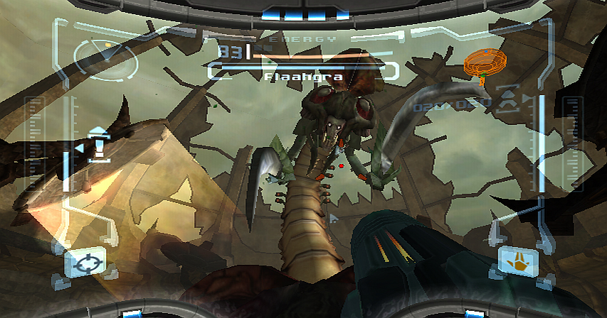
One regret I had in never owning a Gamecube was that I never got to play Metroid Prime, a game that so many people had misgivings about (“Metroid in 3D? In the first person? Impossible!”) yet was actually critically acclaimed and ended up being one of the best games on that system. Fortunately I did get to play it on the Wii, plus it’s two sequels and with enhanced motion controls, all in one package.

In terms of adventure I felt that Metroid Prime was better than Super Metroid. It had the same atmosphere of Super Metroid and the same sense of adventure but felt much more immersive. The addition of the scan visor also meant that plot details could be viewed (or not if you didn’t want to), so you would read journal entries from the enemy describing how “The Hunter” (a.k.a. you) was slowly infiltrating their bases. And I thank Nintendo for adjusting it to use the Wiimote and create a real first-person control scheme.

Metroid Prime 2: Echoes was the Gamecube sequel and followed in roughly the same footsteps as Prime but introduced that old gameplay staple of the “dark world”: splitting the world into both light and dark  meant double the size of the levels and some ingenuity of puzzles. Personally I found this game difficult; I still enjoyed it but every time you entered the dark world it would sap away at your health, forcing you to find shelter in special “safe zones”. This meant things were more tense when you’re trying to escape enemies whilst also desperately trying to find the next safe zone. Plus there were some sections which almost had me pulling my hair out in frustration; in general, it was harder than Prime.

Metroid Prime 3: Corruption was the true Wii sequel to the trilogy and it showed; designed completely with the Wiimote in mind it added certain actions like flicking the nunchuk in a whip-like fashion and using the Wiimote in certain situations by having to twist it this way and that, plus the graphics were much improved. Overall it was a solid sequel and altogether one of the best deals I’ve purchased.

The Legend of Zelda: Skyward Sword

Image courtesy of G4

And so to my most recent game which I’m still trying to complete after a year! (Not because I’m bad but trying to find the time to devote to it is tricky for me now).

There is one reason why this game is great: pretending the Wiimote is a sword, like everyone imagined they would do when they first heard about the Wii. Swinging in a particular direction makes Link swing exactly the same way, which actually adds some strategy to the usual hack-and-slash action. For instance, I could swing horizontally but the enemy could block that direction; only a vertical attack would work. Things get interesting when enemies keep dodging and blocking your attacks forcing you to adapt as well.

Apart from the sword your other items have motion controls too; swing you Wiimote like a whip to use the whip, pull back your bow string as you would expect, push your shield hand forward to perform a shield bash attack, and so on. Finally Nintendo made good on their promise of motion controls being the future.

The End?

And that’s my life so far. Like I mentioned in part 1 I’m not sure I’ll be able to keep playing lengthy games anymore, partly due to lack of interest and partly due to time constraints. I’ve got a few games on my phone which may be more manageable, but I’m guessing I will now wait until my children are old enough to want to play computer games too before I start again.