It’s been a few months since I upgraded my laptop to Windows 8. At the time Microsoft were letting you purchase the upgrade for around £25 which sounded like a bargain to me – my wife got it even cheaper at £15 due to purchasing a Windows 7 laptop recently. So I dutifully downloaded it, was amazed at how the installer just seemed to work (surely upgrading an OS should be more troublesome than this?) and set about using it for everyday use.
So after a few months of use what is my overall opinion? While I find it perfectly usable I think Microsoft may have been a bit too ambitious trying to convert Windows from a big desktop OS to what is now primarily a tablet OS and the jump between the two is currently too large. Now I’m not saying it is a complete disaster – we’re not at Vista levels at all – as there are still quite a few things that I am happy with but given that my laptop has no touch inputs at all and the entire OS seems hell-bent on pushing these new Modern touch-enabled apps in your face then it leaves a user like me feeling a little left behind in this brave new world.
But first let’s focus on the good parts of Windows 8 before I venture into the “could be better” points.
Performance
Windows 8 is fast, very fast sometimes. Whatever Microsoft did to the internals of Windows to make it fast enough on less powerful hardware has also paid dividends on more powerful hardware. A cold boot is faster than Windows 7, waking it up from a sleep state even better (it feels like around 10 – 15 seconds to me) – when I compare it to starting up my Windows 7 PC at work it feels like it takes an age to just get to the login screen now.
Live Tiles and the Start Screen
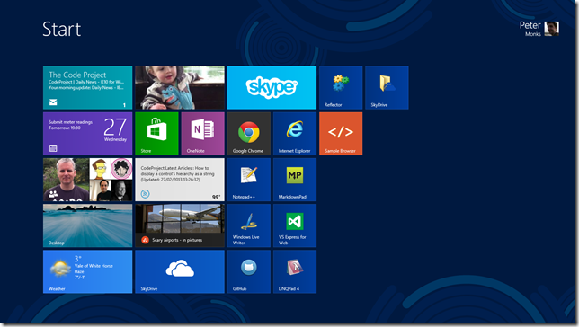
I own a Windows Phone 7 device so I’ve already grown accustomed to the UI intended for all future Microsoft products. I personally think that the Live Tiles idea is probably one of the simplest, best and, dare I say it, most original ideas that Microsoft has come up with in a long while. Live Tiles act as both a shortcut to start an application but also as a widget which provides live information to you when you just stare at the Start Screen; information changes on it as you watch it to show you your latest emails, latest Facebook/Twitter mentions, photos etc. If you have a good enough set of apps installed your Start Screen can suddenly come alive with all kinds of information and I quite like waking up my laptop in the morning and quickly seeing how many emails I have.
And speaking of the Start Screen I have no problem with it; many people got indignant over the loss of the Start Menu but frankly I haven’t missed it at all. It also comes with some nice bonuses such as being able to uninstall anything straight from the Start Screen, and the search functionality is far better than Windows 7.
Desktop Improvements
Despite the focus clearly being on the Modern UI the existing desktop has seen a few new features too.
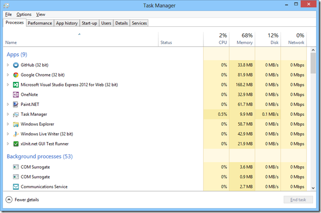
The Task Manager is now something I love rather than something I use to kill non-responsive processes. The detailed view can show you the CPU, disk, memory and network usage of every process running which provides you far more information than before. Checking network usage is actually incredibly useful – I had problems recently with the BBC iPlayer and used the Task Manager to confirm whether it was actually downloading anything or not.
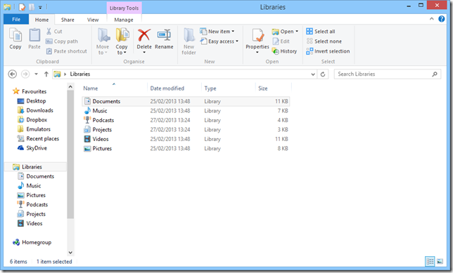
The Windows Explorer has also seen some improvements such as a ribbon bar to replace the menus (though collapsed by default, I’m guessing due to all the complaints from various users during the consumer reviews) and much better handling of copy-paste operations such as detailed progress and resolving name conflicts.
OneNote MX
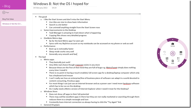
Not a part of Windows 8 per se but I thought I would give this a mention; I love OneNote in Office and the OneNote MX app you can get from the Windows Store is probably one of the best examples of a Modern app I’ve seen yet. It’s not perfect – sometimes feeling a little like a prototype of what Office might become – but the fact that I can write my notes and have them sync to SkyDrive to later check on my phone/work PC makes it a fine example of how Microsoft is starting to think beyond the “single PC” ideology that has been governing Windows for decades, plus it is a great example of what you can achieve in a Modern app.
But…
So there are a few things I am happy with and I wouldn’t want to go back to Windows 7. But having said that there are still quite a few problems with it and they tend to revolve around the sudden shift in focus on making it into an operating system designed for every device imaginable.
Modern Apps
I’m going to make a sweeping generalisation here: nearly all Modern apps suck! OK, maybe that is a bit too harsh so let’s try to break it down as there are several areas to this.
I have no problem with the “Metro”/Modern UI style as I generally quite like the simplicity of it all; on a phone it works quite well, and I imagine a tablet would be the same. But for a widescreen monitor things can tend to look a little sparse with a lot of empty space, particularly since Windows 8 forces all Modern apps to be full-screen. Also it is a style which allows less artistic people (e.g. developers like me) to be able to make something that generally looks quite good and hopefully more consistent with the rest of Windows but this is a double-edged sword; a lot of Modern apps I’ve seen so far are devoted to lists/grids of rectangles with some text in it so they are never that pretty to look at.
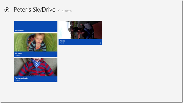
This is what my SkyDrive app looks like – pretty sparse and flat wouldn’t you say?
These apps are also the latest in a long line of developer technologies that Microsoft tends to flaunt every few years; this time Windows RT is the latest hotness. As all these Modern apps are basically version 1.0 then it becomes very clear that this is a platform that needs time to grow and develop. Currently many apps I’ve seen can be very basic or at worst buggy. MetroTwit for instance never seems to be able to load my Twitter timeline, something I would have thought quite crucial given what it is designed for; as a result I uninstalled that almost immediately.
The fact that all Modern apps have to run fullscreen may make sense on a tablet where screen estate is limited but I really cannot see the point on a full-blown PC. At my workplace I have two monitors so I would be limited to viewing two apps at once whereas previous Windows versions would allow you to have as many windows open as you wanted and organised however you wanted. I mean, do I really need to devote an entire monitor just to see my Twitter feed? At the moment the Modern apps I do use I have to constantly switch between with Alt-Tab to get anything done.
Touch input is the main draw for Modern apps – but only if your hardware supports it. Using a mouse and keyboard is possible but not the best, in the same way that touch is not ideal for using the Desktop. Given that most new PCs would be supplied with Windows 8 by default now but not necessarily the hardware to use it for it's ultimate potential this becomes even more frustrating.
But probably the biggest problem with Modern apps so far is not related to technology or usability but one simple question: what are they for? Every single Modern app I’ve seen has a very clear focus, which is to act as a frivolous, content-spewing machine; why not check Facebook or Twitter or news or weather or anything that is actually not very important to your life or work. Can you honestly see a line-of-business Modern app existing as things currently stand? I can’t. Given that Microsoft have spent so long trying to keep their enterprise customers happy it seems they have now switched sides rather abruptly and are now too focused on the casual user instead, rather than find a happy medium.
Windows Store
Fine, lets assume that you do find some good Modern apps – that means you need to find and install them somehow, which is where the Windows Store comes in. Except that this is also a terrible Modern app in itself.
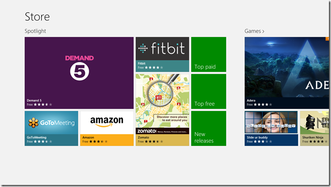
Take a look at the screenshot above; what attracts you to getting, or even buying, any apps? Do any of them jump out at you? Of course not, they are all flat squares with possibly a single image and their name, basically an example of where the “Metro”/Modern style fails.
I’m no expert in commercial dynamics but if I went into a store to buy something I would expect to be bombarded with colours, images and banners trying to advertise everything under the sun – what we have here instead is everything hidden away and not showed off to its full potential. There may well be some truly excellent apps hidden away in there but Microsoft are simply not marketing them well enough. Since these are all you can install on a tablet device I would have expected something with a bit more flair to try and entice people to parting with their money.
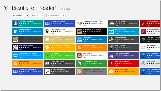
Searching through the Store is not a very informative experience either
There are also technological problems too; the Store app is incredibly buggy. I’ve encountered warnings saying that internet connection is lost constantly and apps failing to install for some bizarre reason. If this is the only way into getting any software onto your device the Store should be as rock-solid as possible. It also poses this question: if the Store app manages all your Modern app updates how does the Store itself get updated?
General OS Gripes
Finally there are some general niggles that bother me.
The Charms bar I cannot see any point in, even on a tablet. When you swipe in from the right-hand side you are now presented with a bar of “charms”, or extremely common operations that are now built into the OS, such as Search, Share and Settings. Search and Settings I get – nearly everything these days require these functions – but Share simply looks like a symptom of the times we live in; perhaps there will be clever uses of this charm but for now all I can see it being useful for is to share things to Facebook/Twitter. If I’m working in Microsoft Office do I really need to tweet to everyone that I’m working on a PowerPoint presentation? I can see some point to sharing though but why not just limit it to the applications that require it rather than provide a great big button directly in Windows itself?
Windows 8 is also clearly a transitionary OS as is evident by having both the “Modern” Windows and the “legacy” Windows but this divide can also be confusing as there are now inconsistencies between how to do things. For example:
- Windows 8 has a fullscreen settings screen but this is not enough to control everything so sometimes you will have to dive back into the Control Panel (which has not been “modernised”). And interestingly some settings are duplicated for no particular reason – setting up a Homegroup can be done exactly the same in the Control Panel or the new setting screen, so why have both?
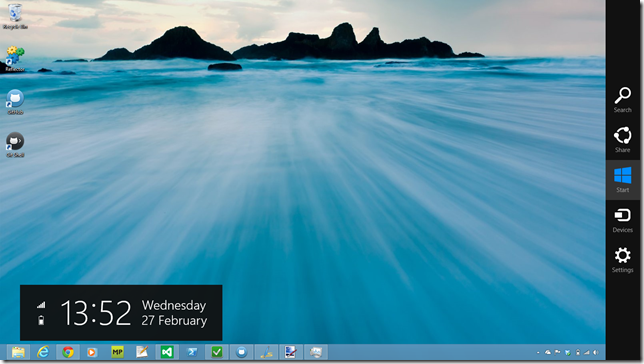
- The Desktop can also view the charms bar yet these become even more useless since the Desktop was not built to use any of them. If that is the case why show it at all?
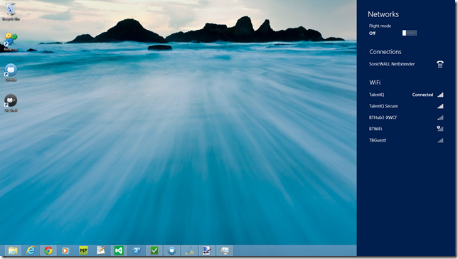
- The Desktop shows the time, date and items like network connectivity and battery power in the taskbar. The Modern UI hides all of those useful indicators until you make the charms bar visible.
An example of UI inconsistency – I’m in the old Desktop yet now I’m also in the Modern UI too?
Ironically in this touch-enabled future keyboard shortcuts have become the only way I can actually get to anything quickly these days; shortcuts like Win+C are far easier to perform that hovering my mouse cursor into a “hot-corner”, dragging down slightly and clicking on the charm I need. Also, as an experiment, get a brand new user who’s never seen a Windows 8 machine before to try and figure out how to close a Modern app or even how to switch off the device – see how long it takes them before they give up. I had to look these up online before I could figure it out and even now closing a Modern app is not intuitive – Alt-F4 to the rescue!
Is it Really That Bad?
No, of course not. Like I’ve already said I do like Windows 8 but mainly from a desktop user perspective. And while I do have a few Modern apps that I like overall I’m just not impressed with them.
The problem I see is that Microsoft took a big gamble trying to get Windows to work in such a way that it is suitable for any device, be it a phone all the way up to a PC, but I’m not so sure this gamble is paying off. Each device type is meant to cater to a particular set of requirements; phones and tablets are not meant to be processing powerhouses and are meant to be used on-the-go so making lots of content-consuming apps makes sense for those devices. PCs and laptops are meant to be more powerful and allow more finer control so it makes more sense to develop more productive apps (like Office) for them.
It may be that, one day, we are all using tablets for our computing needs so we need this OS which is touch enabled and easy to use but I don’t think that day has come yet and Microsoft have made that leap too fast too soon, leaving all of it’s users having to catch them up. Ultimately I’m starting to think that Apple may have had the right idea; build an OS for mobile devices and PCs but not both.
Now I’m not one for criticism without at least trying to present some suggestions for improvement. After all, everyone has their own opinion on how things should work. I intend to write up how I personally think Windows could have been done whilst also moving it forward but I will leave that for another post, so stay tuned for that.
